During my research, I frequently have to check reciprocal space reconstructions and take a really close look at the reflections, compare shapes, intensities and amount of diffuse scattering. This is not an easy task to do with grey scale images, as some others may have already found out. It took me some time to find something useful to speed up the process and I want to share some of the things I found on my way.
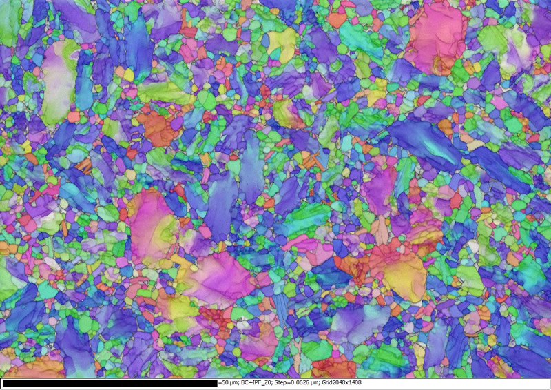
Figure 1: EBSD image taken from www.EBSD.com
EBSD images, such as presented in Figure 1, are very colorful and let’s be honest: They look darn nice! There is a lot of information encoded in these colors which helps interpreting the data. These beautiful pictures have spawned several copycats that try to be beautiful and highly informative. Sadly there are very few examples outside of EBSD imaging where this approach succeeded. In the following, I want to show you an example from one of my own data sets illustrating how I achieved a better understanding of my experiments by an intelligent usage of colors.
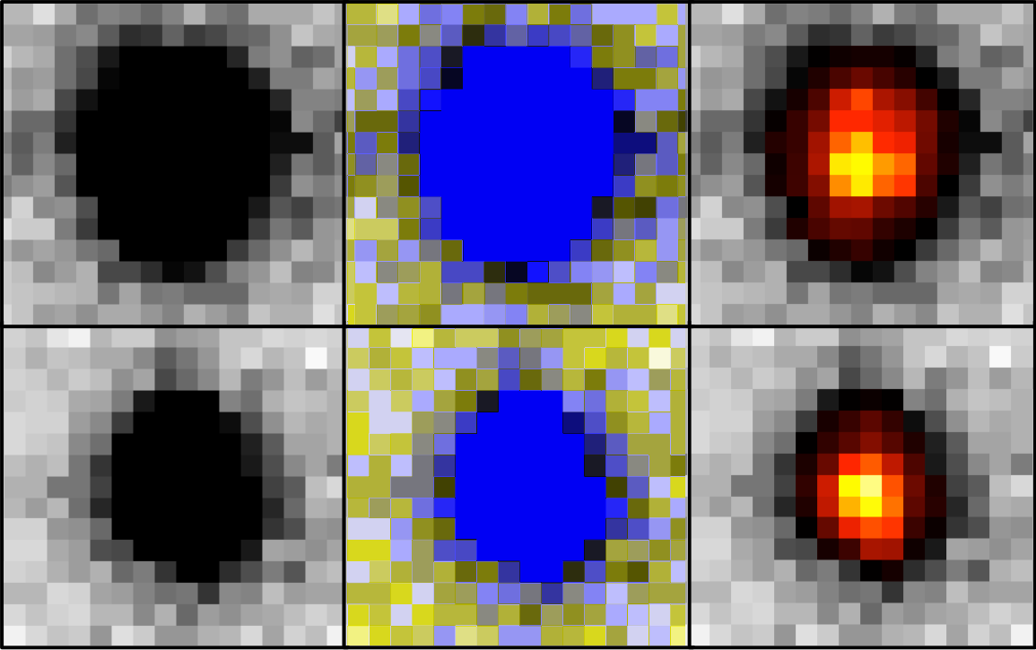
Figure 2: Each row shows a single crystal diffraction peak from a synchrotron data set. The left column is in the standard black and white coloring scheme. The middle column uses a palette swap coloring scheme. The right column uses a high-dynamic range color scheme.
In Figure 2, I want to show two hand-picked Bragg reflections from one of my synchrotron data sets and what can be achieved with a clever change of color. In the first column there are two different Bragg peaks of more or less the same size and shape in the standard black and white coloring scheme. The only qualified observation we can make here is to acknowledge that there is a reflection present.
The second column shows the same reflections, this time in one of the many re-colorings CryAalisPro has to offer. This technique is called palette swap and was popular in the early days of computer gaming. It is very easy to implement and has a huge variety of options in almost any scientific or graphical software package. The different colors may be pretty but they cover one important fact: There is absolutely no gain of information by palette swapping. If you compare the first and second column of Figure 2, there is no more information to be extracted from the second column than the first.
The last column uses a high dynamic range coloring scheme, which is, in essence, a more complex palette swap. The actual process is that all data below a certain threshold are treated with one color palette and all the data above with a different one. The two resulting images need to be merged afterwards. The term high dynamic range is coined by the software Albula, which introduces this feature. If we now compare the top and bottom reflection, we see the bottom one is more intense (brighter color in the center) and while the intensity drop in the top one is almost uniform in all directions, the bottom reflection has a sharper intensity drop toward the top and the right side of the picture. Also, the dynamic range I chose for this image, marks all pixels belonging to the Bragg reflection in yellow and orange colors, while the red and black pixels belong to diffuse scattering.
Just to reiterate, the last coloring scheme allowed not only a distinction of two seemingly similar reflections, it also prompted a qualitative description of the peak shape!
I hope that I succeeded in showing you an interesting example of the effective color use for a better visual interpretation of some data sets. If you have any comments about it, we are happy to read them!